iKnowMed, redesigned around the workflow.
iKnowMed G2 had the oncology functionality, but it was scoring behind OncoEMR, Epic Beacon, and even McKesson's previous EHR on KLAS rankings. We rebuilt it on a new tech stack with a UI organized by what oncologists actually do, not by what features happened to ship.
Context
The functionality was there. The form wasn't.
iKnowMed G2 delivered the oncology functionality clinicians needed. The problem was using it. Too many clicks. Too much navigation. Too much cognitive load on physicians who were already operating at the edge of their capacity. The result showed up everywhere: physician burnout, KLAS rankings behind every meaningful competitor, and competitive risk that was getting harder to ignore.
The redesign needed to do two things at once. Deliver new functionality aligned with Ontada's strategy (Clinical Trials and Precision Medicine), and rebuild the UI on a new tech stack so the product actually felt like something a doctor would want to use.
iKnowMed had been designed feature by feature, not workflow by workflow. The redesign inverted that, starting with how oncologists actually move through their day, and only then deciding what features the product needed to support it.
Team
One of seven, leading the surfaces that set the tone.
I was one of four UX desktop designers (with Cori Dymond, Megan Lui, and Faith Furlough), partnered with three UX mobile designers (Jayson McCauliff, Soumo Karar, Phoebe Dyloco). Within that team, my work spanned:
- Authoring research and discovery proposals.
- Leading and conducting user interviews across clinical roles.
- Collaborating on research synthesis and developing personas.
- Leading feature wireframe explorations for the Dashboard and Visit List, two of the most-trafficked surfaces in the EHR.
- Designing the My Profile modal, the For Me homepage, Account Authorization and Creation, Clinical Notes, Medications, and more.
- Collaborating on finalized visual design and stakeholder presentations.
Audit our own product. Then study the field.
The process started with extensive research on the existing EHR's functionality, paired with secondary research across our competitors. Goal: a clear-eyed view of the gaps and the opportunities.
Secondary research
Compiled the existing data we had on our own EHR and dove into competitors across every platform we could observe.
Users and stakeholders
The clinical team using an oncology EHR isn't one user, it's many: physicians, nurses, schedulers, front desk, billing, admin. Each has a different relationship with the product. Identifying every role and how they interacted with the system was essential before any wireframe got drawn.
ideate
Personas, workflows, and what to ship first.
Started with user interviews across every clinical role. Mapped current-state workflows and future strategy plans. Because the team using an EHR has wildly different goals depending on where they sit in the clinic, we built personas that anchored every decision back to a real role.
User profile exploration
Mapping the personas across roles, so every design decision could anchor back to a real user.
Mapping the workflow
Treatment phases and follow-up workflows mapped end-to-end, so design decisions could be tied back to the real clinical sequence rather than the existing feature taxonomy.
Feature dependency
Because this was a redesign of a working EHR (not a greenfield project), understanding which features depended on which others was essential to staging design and engineering work without breaking the product mid-flight.
delivery
Rethinking the surfaces clinicians live in.
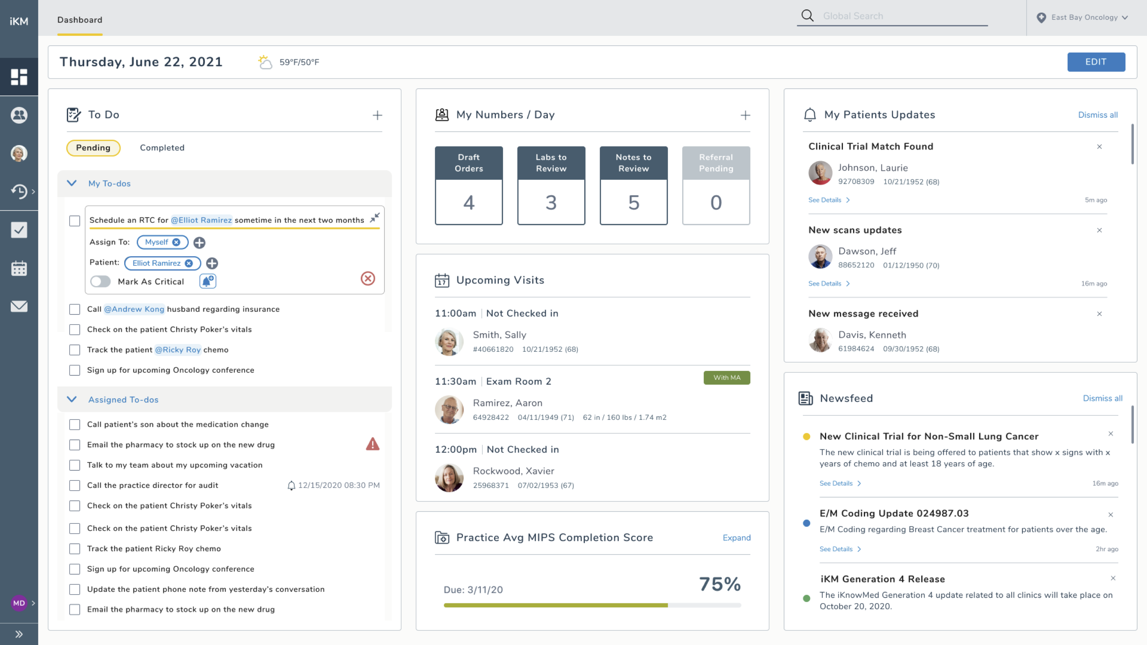
The Dashboard
I led this feature with one purpose: rethinking what an EHR dashboard could be. Not a dumping ground of widgets, but a true entry point that surfaces what each user needs based on their role and the day's clinical reality. The exploration moved through a singular dashboard pattern, then a split practice-and-personal dashboard pattern, and finally a focused, role-aware design.
The Visit List
Leading exploration and design for the Visit List, I focused on the user's goals and needs and what they actually need to know to accomplish their tasks, not what the system happened to track.
Design principles
We established a small set of principles that guided every decision across the redesign, so the work stayed cohesive even as the team scaled across surfaces and time zones.
walkthrough
The redesign in motion.
A walkthrough of the final design across two clinical roles: front desk checking a patient in, and a scheduler checking a patient out. Video direction by Cori Dymond, voiceover by me.
Functionality and form, both.
The redesign delivered the functionality Ontada needed (reporting, interoperability, alignment with Clinical Trials and Precision Medicine strategy), revised the core workflows (scheduling, noting), reorganized the structure and navigation, and produced new design-driven experiences for surfaces that had been treated as utilities for years.
Time for the future vision was the gift.
Most product redesigns get squeezed by next-quarter pressure. This one didn't. Being able to dedicate real time toward the future vision (instead of incremental wins on top of the existing surface) was a rare gift. It let me push limits and rethink what an EHR could feel like with the user in mind, not the feature backlog.
What I'd carry forward: starting with the workflow, then deciding what features serve it, instead of the other way around. That sequencing is the difference between a product that gets used and a product that gets endured.